

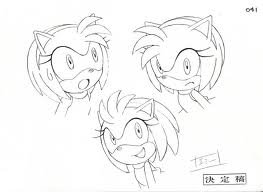
 First off, Yuji created Sonic as an armadillo, now known as the character - Mighty the Armadillo. They slowly started to develop as Yuji's partner, Naoto Oshima, got a hedgehog, with an unusual spiky tail, by adding that on, they decided to have the colour teal to the character. They codenamed him, "Mr. Needlemouse". But after many debates, a hedgehog seemed better, and so changed the breed and colour once again, to blue, to match SEGA's logo. Once the character was created, they wanted to give him an outfit - Shoe's, so got there inspiration from Michael Jackson's shoe's and Santa Claus, also the contrast colours on Jackson's Album - Bad. For some reason the personality was based on Bill Clinton's "Get it done" attitude. The name "Sonic" came last, as they wanted something catchy as their mascot, as so named him after his ability - Speed, so it was - "Super Sonic Speed".
 Ratchet and Clank - Created by Insomniac Games/Wes Louie


Mark Cerny created many characters through the Ratchet and Clanks game with a group of people. Ratchet was designed over looking at different features of dogs, cats and lions. Many forms of characters were created through looking at animals, they wanted a space adventure concept to the game, were everything involved machinery and robots with life - Hence Ratchet having a robot on his back - Clank. They looked at animals such as rats, lizards and underwater life, portraying them on hind legs with added unusual features, such as the machinery. (The picture on the top right of the giant octopus, has an added feature of a fire armed pack on it's back.)
Tim Burton Designs


Most of the character designs Tim Burton does are very unique in their own way. He creates the characters taller, slimmer, wider eyes, and shadowed. Even though he is creating concepts for characters that have already been created, he creates a design suiting him, along with the suit of the film itself. Burton has always been a fan of darkness, and so most of the concepts contain a lot of doom and gloom. He is classed a "twisted genius".
Banksey Designs


World disaster seems to have helped with the Banksey designs. They always surround in the areas of what is wrong in the world, sending a message to reality on what things are really like in this world. Using the materials of outside, (walls), makes it more interesting and stands out to the crowd.
Alice: Madness Returns - Created by American McGee, Lewis Carroll


Many designs created for the new Alice game was viewed over by many demons and dark creatures. Looking through their research they found that dark colours such as black, red and golds were always used in dark, evil creatures, and so developed designs through that. Such as one of the designs for the main characters clothing, Alice, enemies and other main characters such as the Mad Hatter.
They were inspired by old Victorian gothic churches, as this suited the time of the game itself, it made the soundings for this game stunning, creating high sealing and detailed walls.